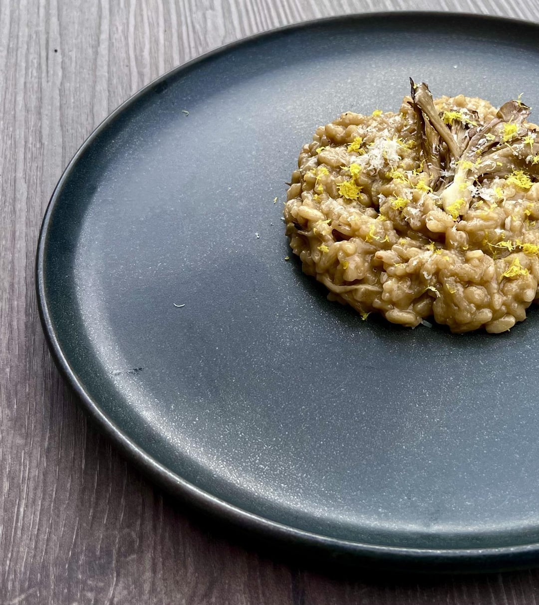
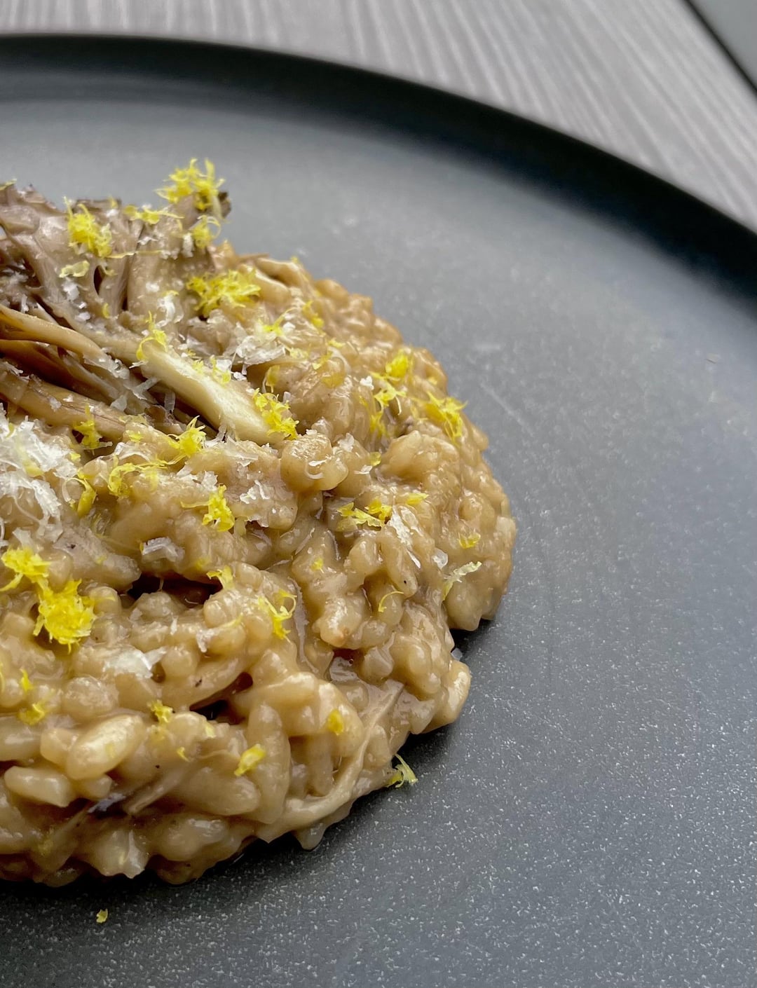
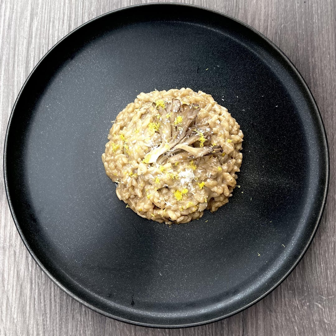
1. I would eat the shit out of that. 2. Why are 2/3 pictures out of frame? Do you want us to judge it on composition or not? 3. Maybe consider some additional color or components or both. Yellow on brown is … A color pop, yes, but they are complementary rather than contrasting colors (check out a color wheel). Something that stands out a little more would be good. The circle is tight (maybe too tight?) but looks good. Maybe more color on that mushroom garnish?
Again, refer to point 1. Would smash.
Zee09 on
Looks like my cat has visited your plate.
Kidding! Looks good
obvioustricycle on
This is a good angle of repose for risotto. Nice and relaxed.

3 Comments
1. I would eat the shit out of that. 2. Why are 2/3 pictures out of frame? Do you want us to judge it on composition or not? 3. Maybe consider some additional color or components or both. Yellow on brown is … A color pop, yes, but they are complementary rather than contrasting colors (check out a color wheel). Something that stands out a little more would be good. The circle is tight (maybe too tight?) but looks good. Maybe more color on that mushroom garnish?
Again, refer to point 1. Would smash.
Looks like my cat has visited your plate.
Kidding! Looks good
This is a good angle of repose for risotto. Nice and relaxed.